As of May 18, 2013, the Dow Jones Industrial Average is at a record high and is trading at a trailing P/E ratio of 16.7
The average P/E of the Dow Jones Industrial Average, using year-end data, since 1926 has been 17.8. However, this is distorted upwards by a few years like 1982 when the P/E was 114 due to earnings that were near-zero due to some unusual losses by some major companies. If we eliminate several similar “outliers” a more representative average historical DJIA P/E is 15.6. Therefore the current trailing P/E ratio of 16.7 is higher than average. (But that may be well justified by today’s record low interest rates.)
This Article uses past trends to explore whether the Dow Jones Industrial Average is now under-valued or not and what return we might now expect over the long-term. (The short-term is basically unpredictable).
Demonstration of how a stock index rises with earnings:
Note that the graphs on this page all use logarithmic scales. Log scales are the ONLY way to properly show a trend in long-term data. On a log scale a constant percentage gain each year becomes a straight trend line. Analysis that uses a “normal” linear scale for long-term data will display an exponential curve with the data appearing to shoot to the moon.
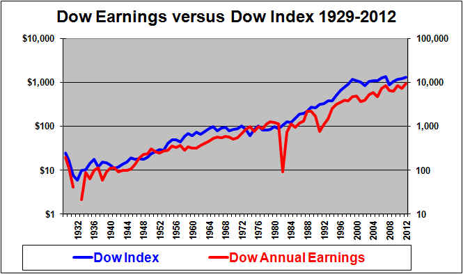
Note that the left and right scales on this graph are consistent. The Dow Jones Industrial Average level scale on the right goes from 10 to 100,000. The Dow earnings scale on the left goes from $1 to $10,000. Each scale rises the same 10,000 fold. The result is that the two lines will coincide whenever the Dow is 10 times its earnings (a P/E of 10). The blue Dow Jones Industrial Average line is above the red earnings line whenever the P/E is above 10.
As we would expect, a very strong relationship is seen above between the (blue) Dow index driven by the (red) Dow earnings. The blue Dow index level line goes more and more above the red earnings line as the P/E rises above 10. The blue Dow level line goes below the earnings line on this graph whenever the P/E ratio is below 10, which based on year-end data last occurred in 1981, although it also got close in 1984 and 1988. In general the slope of the two lines (which represents the growth) is roughly equal over the long-run.
As we are well aware, the Dow index line (blue) declined in 2000 and then reached reached a new peak in 2007 but by its low point in March, 2009 had crashed by about 50%. The decline around 2000 is not that dramatic when annual year-end data is used. And the declines are not that dramatic when plotted on a log scale. Looking closely, we can see here that the crash around 1973 1974 was just as bad as the crash of 2000/2001. The 2008 crash appears just as bad as the crash of 2000/2001. None of these crashes is all that unusual in the context of the long-term. The 1929-1932 crash was much more severe than anything that has (so far) happened since.
Although the short-term is unpredictable we might expect the Dow Jones Industrial Average line to advance in line with earnings growth in the long-term. Below, we will see that earnings growth is in turn tied to growth in Gross Domestic Product or GDP.
Demonstration of how stock index earnings relate to GDP:

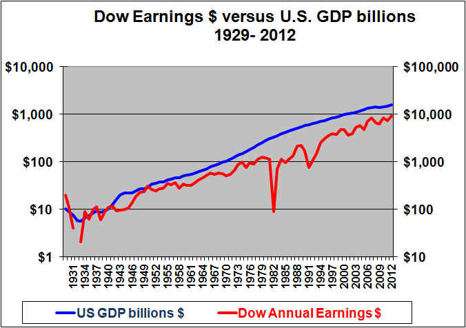
This chart shows that earnings on the Dow Jones Industrial Average stock index (red line) tend to grow at a rate similar to but slightly below the growth rate in GDP (blue line) in
the long-term. (This is to be expected; earnings growth should track GDP per capita growth which lags GDP).
GDP growth is much more stable than earnings growth. Normally, U.S. GDP growth estimates by economists are in the range of 3% “real” with another 2% or so for inflation, for a total around 5%. We therefore should expect large cap stock indexes to normally rise roughly 5% per year on average (although with volatility).
Note that estimates of earnings growth are usually made by stock analysts and often tend to be optimistic. While economists often project GDP growth at around 5%, stock analysts are more likely to suggest that earnings growth will be closer to 10%. Except when earnings have lagged GDP growth for a period, it is unrealistic to forecast earnings growth on a broad stock market index to exceed GDP growth.
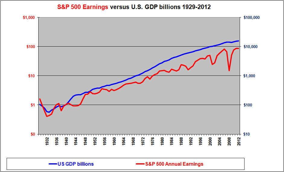
The following is a similar chart for S&P 500 earnings versus GDP.
Demonstration that GDP growth drove the stock index return:
If the level of the DOW is driven by earnings which in turn are driven by GDP, then the level of the DOW is driven by GDP.
This last graph is quite amazing. It was to be expected that the two lines would have similar slopes. The growth in the red DOW index line has been driven by the growth in the blue GDP line. It was a lucky coincidence that GDP in billions happened to equal the DOW index value around 1933. As might be expected the two lines then grew at similar rates (at least in the very long term) and therefore ever after remained at least somewhat close together. In the 1960’s the DOW index got above the GDP line. But this was followed by a long period where the DOW index went fairly flat as the DOW failed to keep up with GDP growth in the high-inflation years. The DOW then made up ground by racing up to “catch” and ultimately briefly surpass the GDP line by the late 90’s. Around 2000 the Dow index fell while GDP continued to grow. With the Dow line now below the GDP line we might forecast the Dow index to again track pwards with GDP growth. However, the graph shows that it is possible for the DOW to stay below the GDP line for an extended period.
On this graph we can also see that U.S. nominal (including inflation) GDP grew at a higher rate during the high inflation years starting in the 70’s. But since then GDP growth has slowed in the recent lower inflation years.
Given a 5% average growth in nominal (after inflation) GDP, we can forecast that the Dow index (currently 15,354 should be around 25,000 in ten years (May 2023). However if the P/E at that time is 15 instead of the current 16.7, then the Dow would be about 22,500.
Conclusion
The level of the Dow Jones Industrial Average can be broken down to two factors. Earnings and the P/E ratio. Earnings growth can deviate widely from GDP growth in the short-term but over longer periods earnings tend to track GDP growth reasonably closely, although it probably lags slightly in the long run. GDP growth has tended to be reasonably steady at around 5% per year (in nominal dollars, including inflation). Periodic recessions reduce GDP growth but it tends to recover.
If GDP will grow at about 5% then we can expect an underlying growth in the DOW index of about 5% annually, although with significant volatility around that. Adding in 2.5% for dividends would provide a total average annual return of about 7.5% (again with very significant volatility around that).
Based on the graphs here, the Dow Jones Industrial Average appears to be bout fairly valued and should produce long-term returns in the range of 7.5% per year.
Shawn Allen CFA, CMA, MBA, P.Eng.
President, InvestorsFriend Inc.
First written September 11, 2006, last updated May 18, 2013
See our related article on earnings versus GDP.


